Your Cart is Empty


Color, The Nitty Gritty
The topic of color is an interesting and complex one. Of course, we all have our opinions about what we like or what we think looks good. But there are an astounding number of variables involved in selecting and quantifying a specific color in the realm of industrial design. Things like ambient lighting conditions, angle of viewing, and the presence of adjacent colors are all variables that can change the color appearance of an object. Add to this the fact that the perception of any given color is highly subjective between individual observers (even under identical viewing conditions) and the topic of color gets even more nebulous. For those interested in the topic, Josef Albers’ Interaction of Coloris a fascinating read.
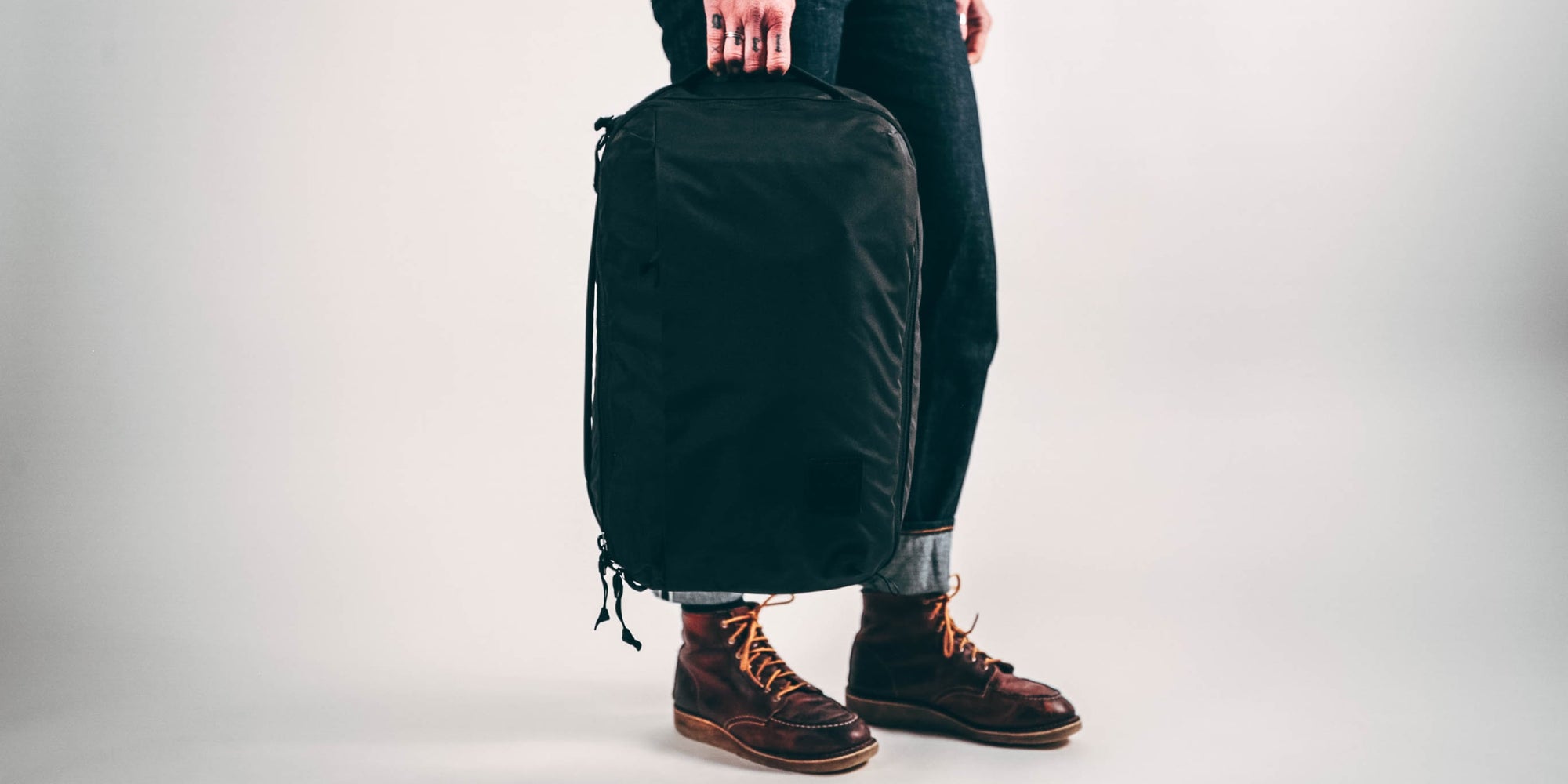
When Jack and I look at color for EVERGOODS, it’s fun to draw out a line plan that includes smokey blues and mustard yellows. But very quickly the reality of ordering volume casts its shadow on the decision making. Every fabric, zipper and width of webbing carries a minimum order for the mill to produce it in a color. Assuming these raw material minimums can be met, the cut and sew factory then imposes its own minimums on how many finished units must be ordered of each color or color combo to justify the machine setup and handling that’s required to manufacture a finished product in multiple color-ways. So, unless your company is placing rather large orders, it can be difficult to offer a large color selection to end customers. This is one reason why most everything is available in black. As a relatively small brand, EVERGOODS puts significant effort into delivering a thoughtful product line using as few different raw materials as possible. This kind of operational efficiency makes sense for any size company, but becomes less critical with larger ordering volumes and can be viewed by some as a hindrance to product design.
One of our main color goals for this year’s production was to set a lining color standard for the brand. Having a lighter colored interior has been part of our design since day one. We thought that the Field Grey from our first production was a beautiful color, and one that really embodied the crossover message of the brand. But it also happens that “Field Grey” closely aligns to the military’s “Foliage Green”, and so high quality webbings, buckles and meshes were available off the shelf in the US without commitment to huge custom orders. As much as we genuinely liked the color, these sourcing concerns had to play an equally important role in the decision, especially during a time when the future of our fledgling startup was completely unknown.
This next production for 2019 gives us the opportunity to revisit some of these decisions with a little more solid footing. Last year’s sales along with future forecasts have given us the confidence and the capital to be more intentional with our color. In regard to the interior of our backpacks, it was time to ask, “What should the priorities of a lining color be?”. Other than not looking repulsive, helping the interior of the bag and its contents be more visible ranked highly. White would be an obvious choice for this as it reflects the widest spectrum of ambient light. It’s long been a standard interior color for everything from homes and offices to tanks and submarines to the International Space Station. As far as luggage goes, I think white makes sense for the interior of a duffel bag or a top-loader, something cavernous with a relatively small opening. But the clam-shell design of many EVERGOODS bags has the ability to open wide, allowing in lots of light if desired. I started wondering what other factors should be considered in order to aid visibility.

My audio earbuds are what started me down this path. I keep 2 sets in my kit. I like the standard Apple ones for hands-free phone calls while driving or walking because you can still hear the environment around you while using them. They’re an Apple product, so of course they’re white. Then I have another pair of noise isolating earbuds that I use when I want to shut out the world around me and hear music during airplane travel or focused work. These are black, and I like that I can easily tell the two apart at a glance, and this got me thinking about contrast as another factor influencing visibility. The more I observed things around me through the lens of this thought, it seemed to me that contrast may actually be more important than reflected light in our particular product. Assuming there’s enough light present to even see, an object is then more or less visible in relation to its surroundings. A white interior may be bright and offer good visibility, but a white cat sitting on a white chair in a white room is still hard to spot. The scene lacks contrast.
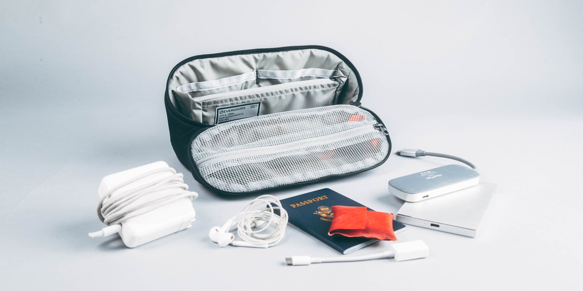
I’d been carrying my earbuds in a little organizer that I have. It’s a black nylon shell with a black mesh see-through pocket. The white buds are easy to see inside this pocket, the black ones are not. When I built a simple test pocket out of white materials, of course the black buds stood out while the white ones disappeared. The visibility of the earbuds was directly related to their level of contrast with the pocket. A quick survey of the small objects in your immediate vicinity will likely show that black (charcoal, ebony) and white (silver, pearl) are two of the more common colors in the manufactured world, so it makes sense to design around these rather than say, orange or blue. When it comes to getting a visual on the white and black earbuds at the same time, the obvious solution is to build a gray pocket. More specifically, a value of gray that is exactly between black and white, giving equal contrast to both.
Whenever practical, I find it extremely valuable to make firsthand observations, even if I think I know what the outcome will be. Often things turn out more or less as you’d expect them to, so it’s tempting to convince yourself that crafting an experiment or going into the field isn’t worth the time and effort. But the benefit of bearing firsthand witness cannot be overstated, and generally pays off with one or two peripheral observations. These interesting little side effects help to flesh out your understanding of the whole, but they’re things you simply wouldn’t have thought of without seeing them. For example, after gathering a random collection of small objects from pockets and desktops and placing them behind black, white and gray meshes, I found that their exact colors became more difficult to discern. At a glance and obscured through a screen an object will fall into being seen as either a “light thing” or a “dark thing” relative to its surroundings. This gives further strength to the argument for a neutral gray construction as light and dark objects both stand out against it, while objects right in the middle can still fall back on chromatic contrast (being a different color) to aid differentiation.
Black Layup

Standard Grey Layup

White Layup

Another interesting thing that I noticed is that white mesh obscures the color of objects behind it more than black. This may owe to the fact that white mesh is actually reflecting more light back at your eyes when you’re really just trying to see past it. Like standing in the glare of a car’s headlights, trying to see the driver. This is why most tents use a dark colored bug screen in the windows, it’s easier to see through. Same with the screens in your home or apartment. While mosquito nets meant to hang over beds or cots often use white to lend a bit of privacy while still being airy. In the end, we felt that neutral gray gave the most positive results across our evaluation. And going through the effort of firsthand observation lends confidence to our conclusion.

Of course, nothing is perfect. There are particular objects like the business cards or the earbuds that may be seen better against white or black. But we felt that gray gave more equal shape and color fidelity to all objects, rather than highlighting some and hiding others. These are the tradeoffs that come with any design decision. So, with the goal of increasing visibility to an unspecified and ever-changing packing list, EVERGOODS has approved the use of Standard Gray for all backpack interiors moving forward.

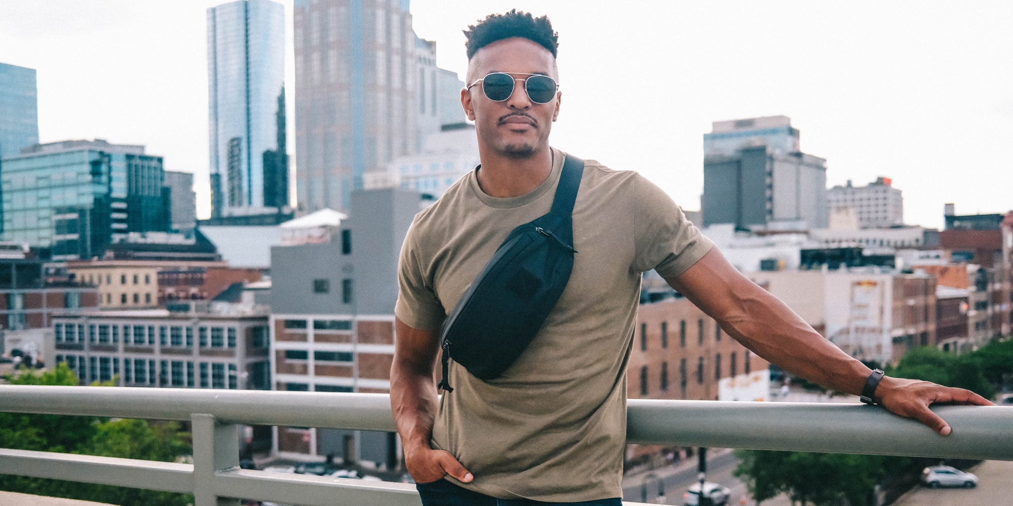
Once we came to understand the properties of this non-color, we sort of fell in love with it. Standard Gray felt modern and clean without being sterile. It has a versatility that seems to fit into every environment and look right with any outfit. It feels as universal as black, but infinitely more interesting. So, we’ve decided to run it as an exterior color for 2019 (shop STANDARD GREY BAGS). Jack and I wanted to offer something other than black this year, and we’re proud of our work so far. With the support of every one of our customers to date, we’ve been able to keep product design at the heart of the business. If you’ve made it this far, thanks for taking the color journey with us. Jack and I are committed to keeping a product-driven point of view as we continue to build EVERGOODS.
Onwards,

Kevin Dee